Civic Tech Field Guide
Sharing knowledge and productively growing the fieldThe Tech > Civic data > Data visualization - (230)
Tools and platforms that visually present information and facilitate understanding of it, such as dashboards. See The Data Viz Catalog for a catalog of types of data visualizations.
Showing 230 Results

Agri Note (Farming Records & Open Data Platform)
Saitama, JapanAn agricultural support app promoting the shift 'From memory to records' in farming.

Private base for open data utilization, operated by NPO Community Link.
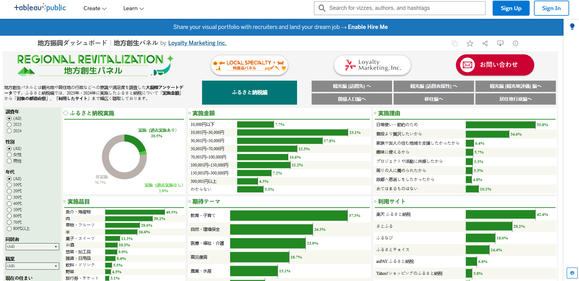
Regional revitalization dashboard by LM on Tableau Public covering local products, hometown tax, and tourism satisfaction

Hyogo Prefecture's open data dashboard published on Tableau Public
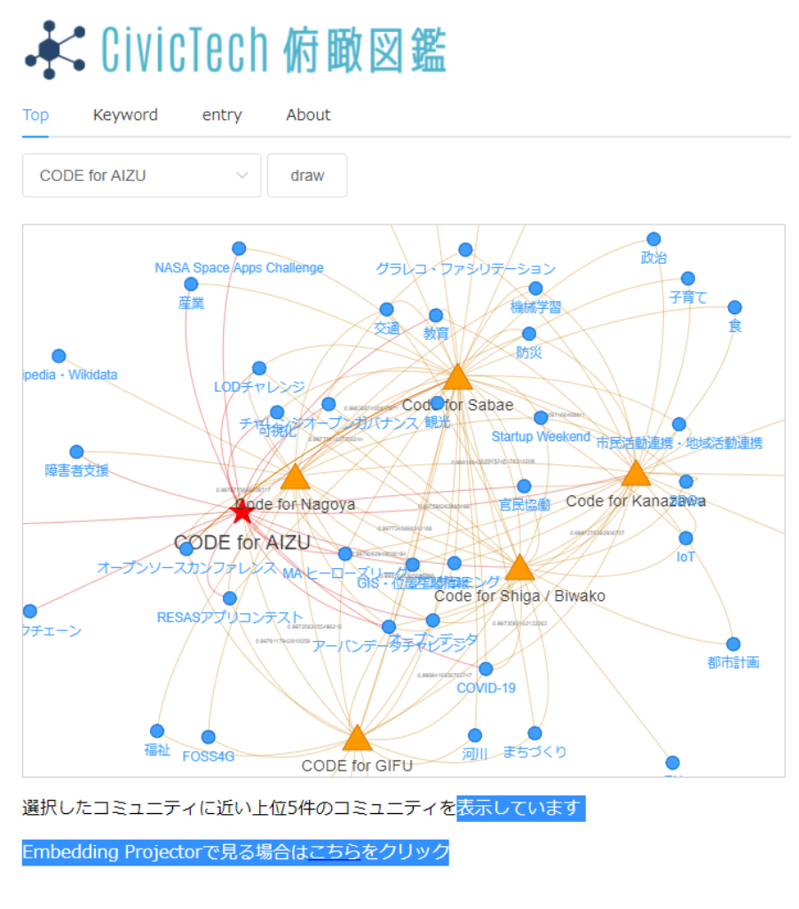
CivicTech Bird's-Eye Encyclopedia
Showa WardA guide map visualizing the characteristics and specialties of civic tech organizations across Japan to help match citizens with the right activities.

What Do Freedom & Equality Mean to Americans Today?
United States of America 🇺🇸As the US approaches its 250th anniversary, AI enables a new type of conversation amongst Americans on freedom & equality.
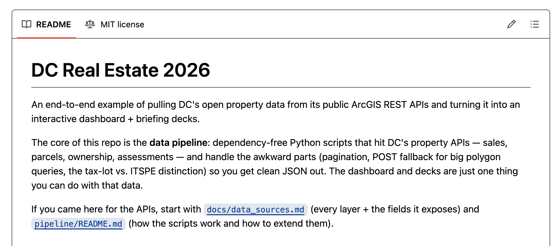
DC Real Estate 2026
Washington, DCAn end-to-end example of pulling DC's open property data from its public ArcGIS REST APIs and turning it into an interactive dashboard + briefing decks.
Your NYC
San Franciscocivic project that takes published documents about New York City and turns them into something interactive — so any New Yorker can browse, filter, and find what's relevant to them.

O data_labe é uma organização que emerge das favelas e periferias com o propósito de descomplicar a cultura dos dados e os direitos digitais.
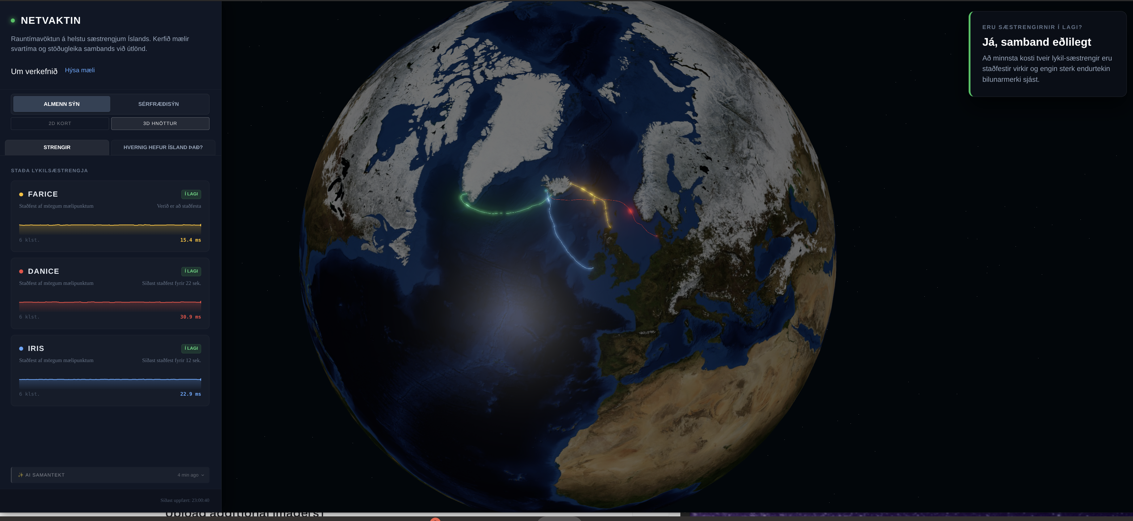
Netvaktin
Iceland (Ísland) 🇮🇸An open-source, real-time network observatory that monitors the resilience, latency, and routing health of Iceland's critical submarine internet cables.
Deep Dive Data
Zimbabwe 🇿🇼Our comprehensive database analyzes banking and financial apps to reveal what data they collect and how they use it.
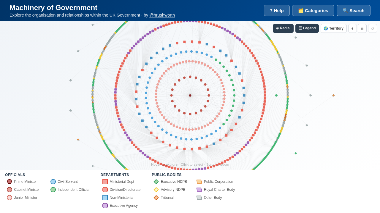
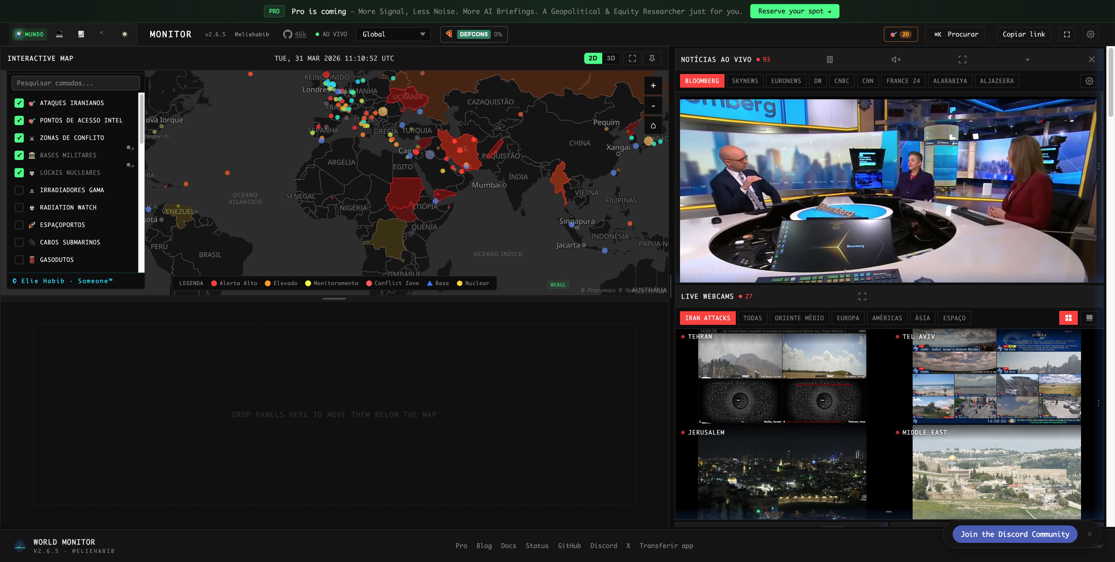
Machinery of Government
United Kingdom of Great Britain and Northern Ireland 🇬🇧An interactive map of UK Government structure — departments, ministers, agencies, and public bodies, with budget and staffing data.

Communalytic
TorontoCommunalytic is a no-code computational social science research tool for studying online communities and public discourse on social media
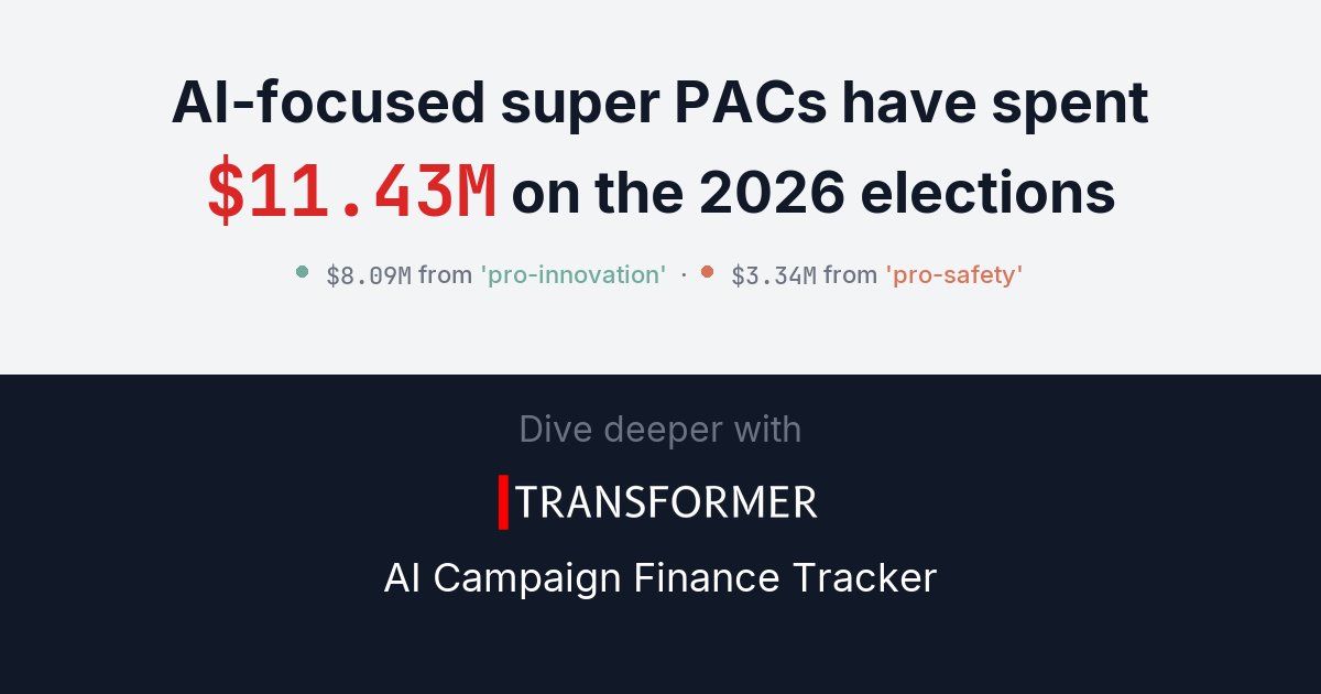
AI Campaign Finance Tracker
San FranciscoTrack AI industry political spending: super PAC contributions, independent expenditures, and employee donations to federal candidates.
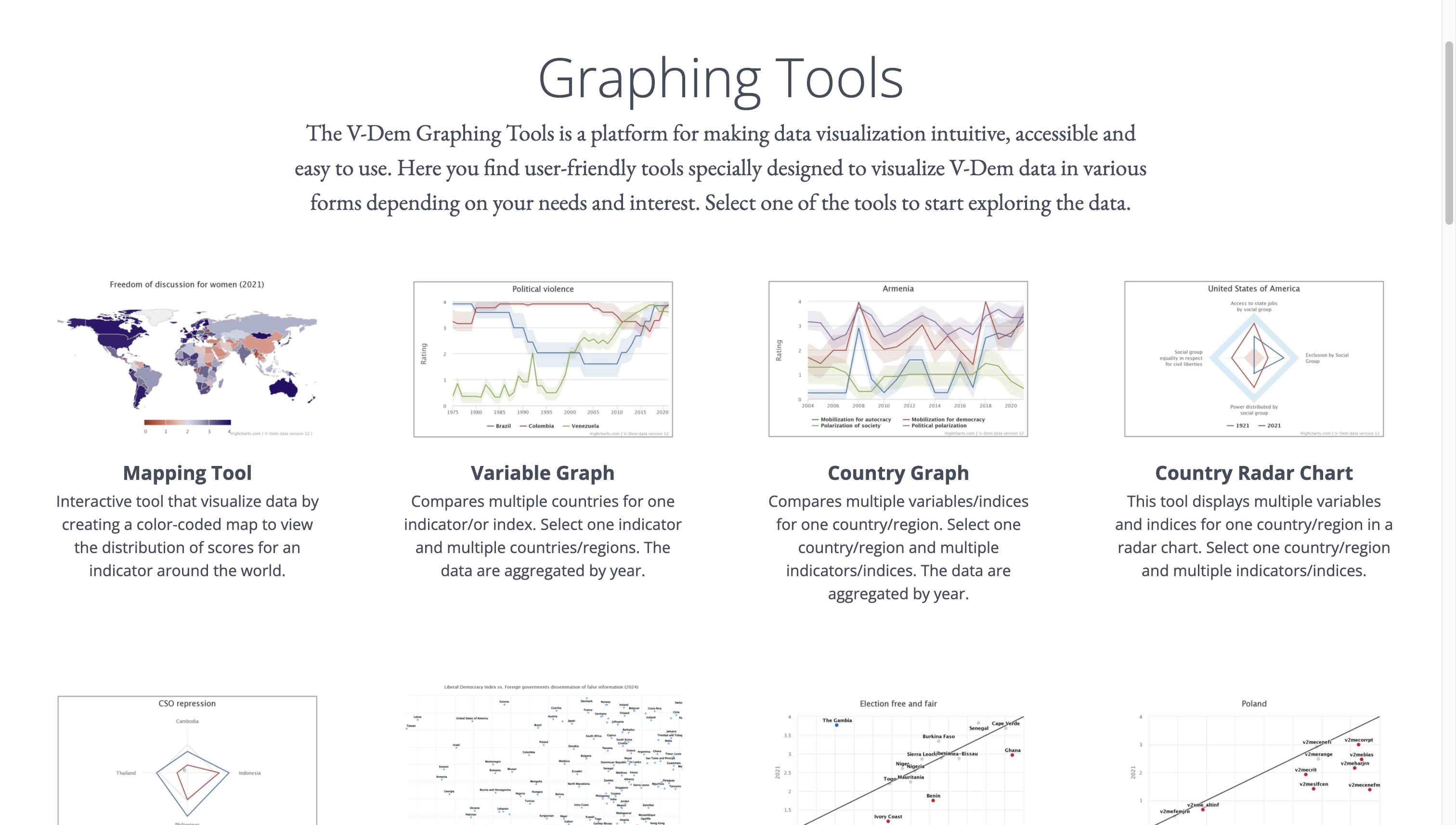
V-Dem Graphing Tools
Sweden (Sverige) 🇸🇪The V-Dem Graphing Tools is a platform for making data visualization intuitive, accessible and easy to use

Democratic Erosion Event Dataset (DEED)
United States of America 🇺🇸The Democratic Erosion Event Dataset (DEED) records discrete events related to democratic erosion and autocratic consolidation across countries and over time.
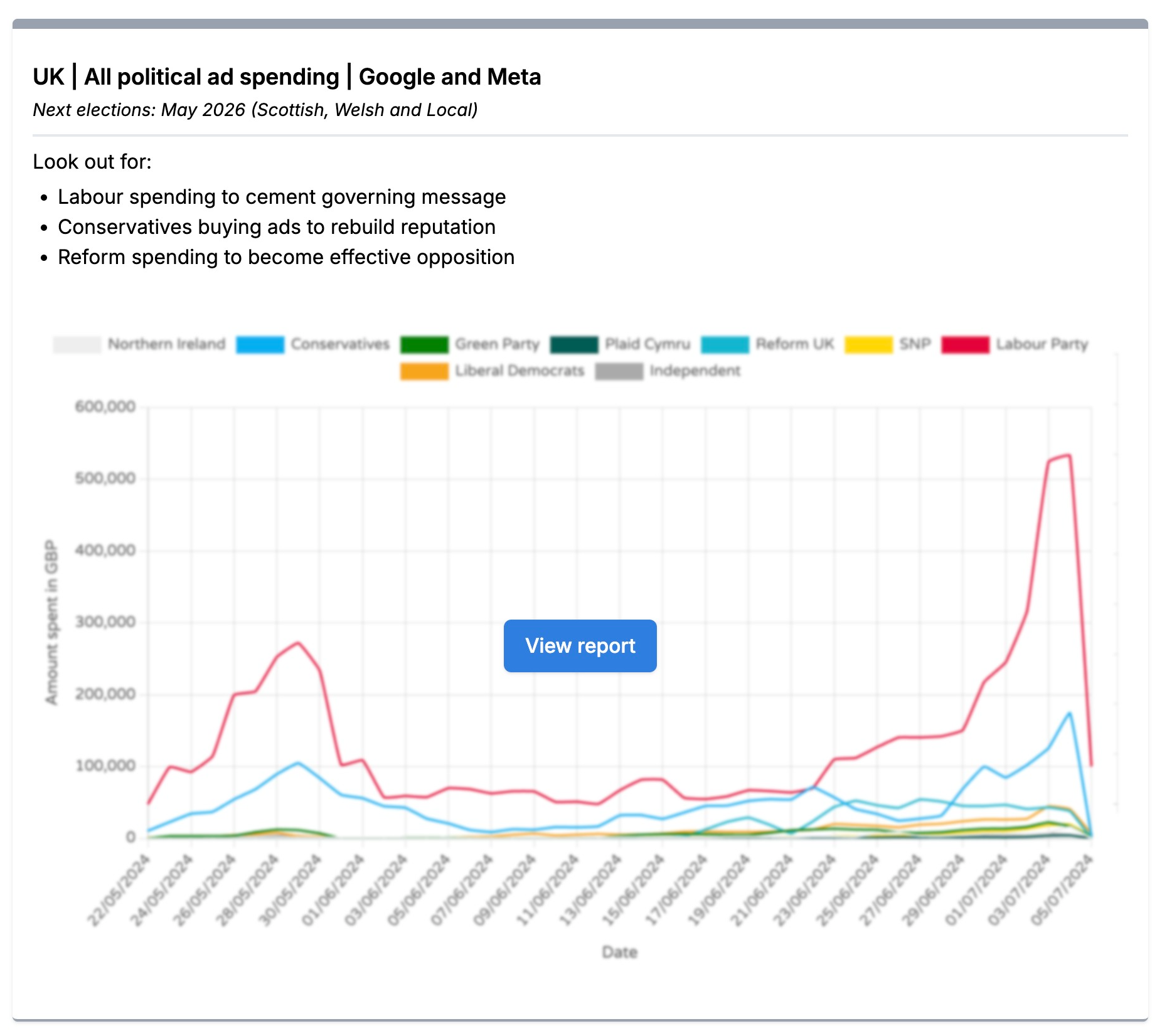
Trends (Who Targets Me)
LondonTrends from Who Targets Me makes navigating and understanding digital political advertising data easier. It operates in over 60 countries, covering 150,000+ advertisers from more than 1,000 parties and groups.
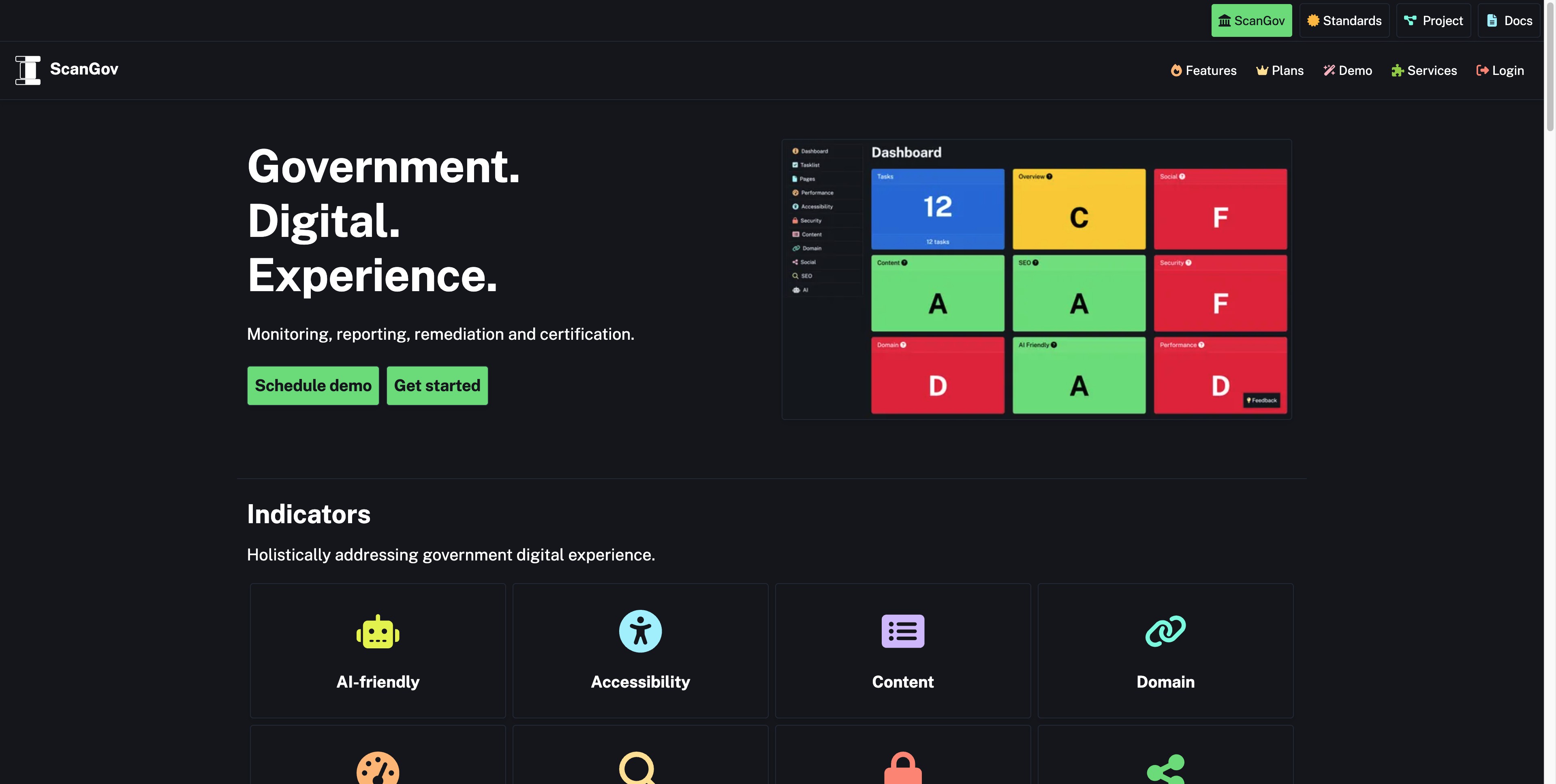
ScanGov
United States of America 🇺🇸ScanGov is a government digital experience platform that helps public agencies monitor, improve, and maintain their websites. The service combines automated scanning with clear guidance to help government teams deliver better online services to the public through standards-based improvements.
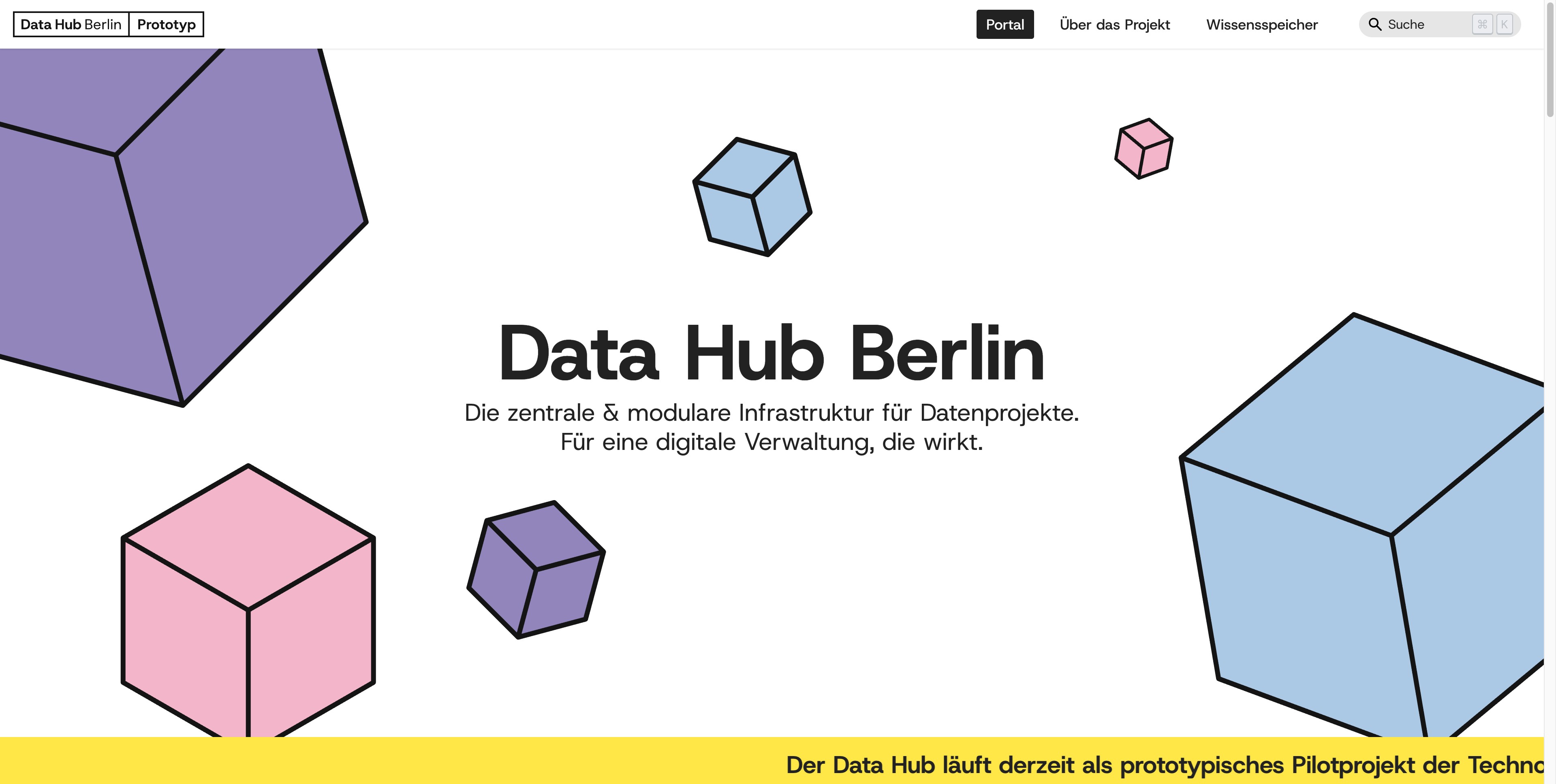
Data Hub Berlin Prototyp
CityLAB BerlinDie zentrale & modulare Infrastruktur für Datenprojekte. Für eine digitale Verwaltung, die wirkt.
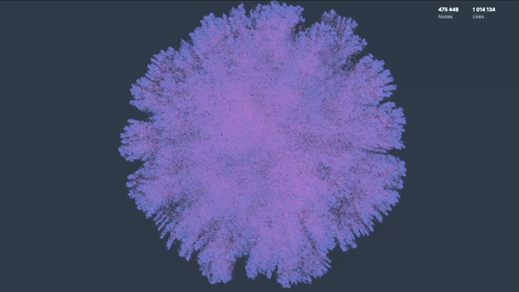
a high-performance WebGL library for visualizing network graphs and machine learning embeddings.
It's like Google Maps...But for navigating complex human perspectives.
Chalk
LondonTransform complex content into accessible diagrams
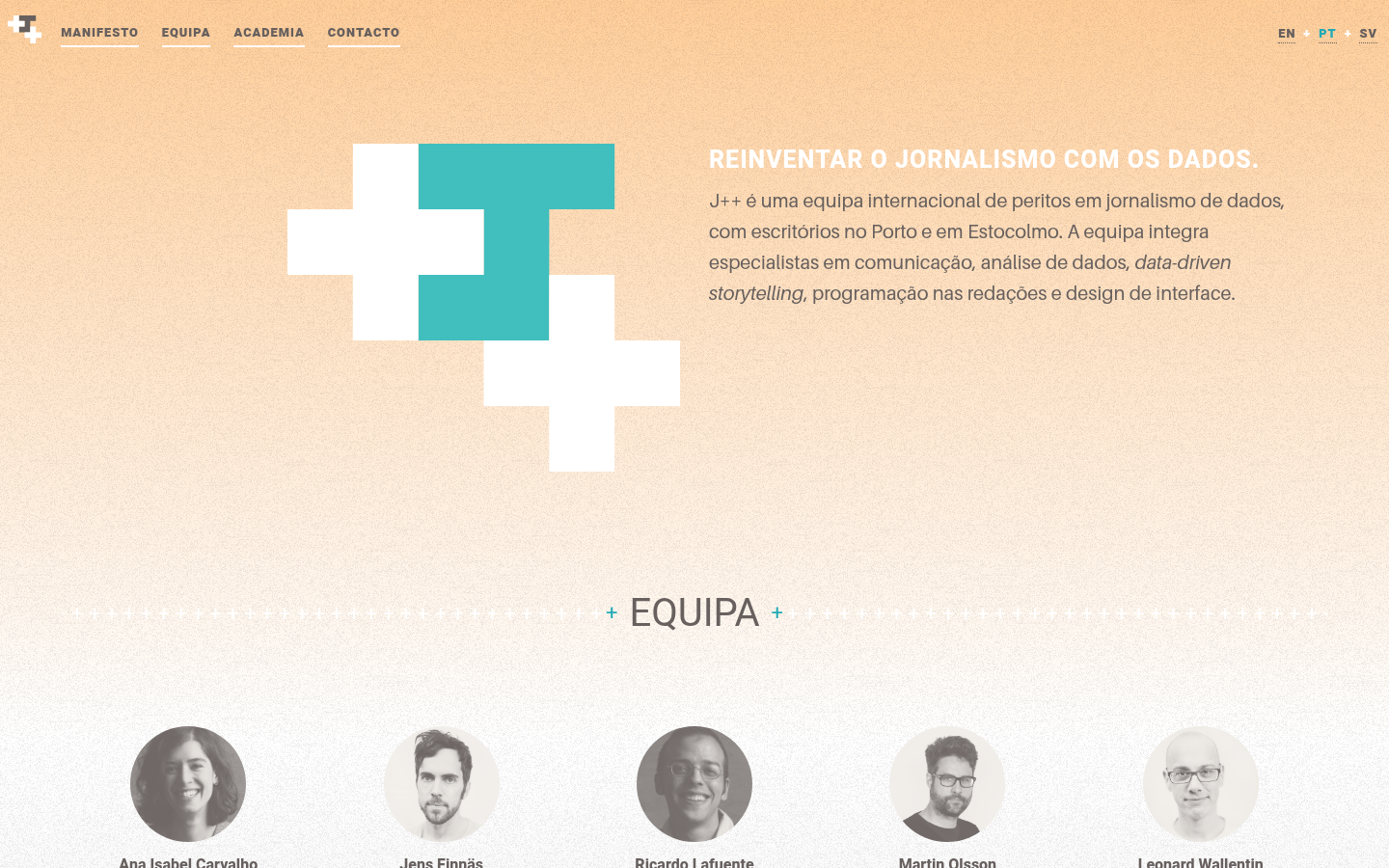
Journalism++ (J++)
PortoJ++ é uma equipa internacional de peritos em jornalismo de dados, com escritórios no Porto e em Estocolmo.
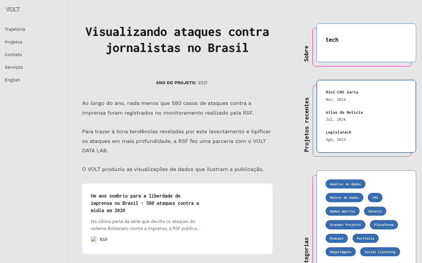
Ao longo do ano, nada menos que 580 casos de ataques contra a imprensa foram registrados no monitoramento realizado pela RSF.

BKK Follow Up
BangkokA 12-year retrospective of problems that have bothered Bangkok residents | สำรวจปัญหากวนใจชาว กทม.

Learn and compare Thailand's constitutions, presented through an interactive website, to enhance understanding of the constitution that everyone shares. | เรียนรู้และเปรียบเทียบรัฐธรรมนูญของประเทศไทย ที่นำเสนอผ่าน Interactive website เพื่อเสริมสร้างความเข้าใจในรัฐธรรมนูญที่ทุกคนเป็นเจ้าของร่วมกัน

What Could BG Be
Bowling Green, KentuckyEngagement project with the city of Bowling Green, Kentucky

The Life and Times of Citibike #32606
New York City (NYC / New York, NY)806 days, 8,624 trips, 7,060 miles. Thank you for your service.

Pardon Tracker
TexasAn independent investigative journalism and data visualization project, documenting the statements, activities, and networks of the individuals that received pardons or commutations for criminal charges related to the attack on the U.S. Capitol on January 6, 2021.

Capitol Riot Map
TexasMapping the networks of the 1,580 individuals who were arrested, charged, or convicted for participating on the attack on the U.S. Capitol on January 6, 2021.

Mike Tahani's data viz gallery. It includes mapping, journalism, politics, outer space, and data visualization.

Storytelling with Data Course
The New School, East 13th Street, New York, NYTaught by Maria Massei-Rosato

Solar Protocol
BrooklynThis website is hosted across a network of solar powered servers and is sent to you from whichever server is in the most sunshine.

Melbourne Urban Forest Visual
Melbourne VIC, AustraliaPeople from around the world are sending emails to trees in Melbourne, expressing their love, admiration, and curiosity about the trees

Providing an open‑source business intelligence and embedded analytics platform for creating dashboards, querying data, and embedding analytics.
Congestion Pricing Tracker
Brown UniversityCurious whether Congestion Pricing is having an impact on commutes in NYC? Take a look to compare traffic data before and after Congestion Pricing

Neighborhood Explorer
Tulsa, OKPlatform for tracking public data metrics for local governments and nonprofits.

Data visualization plots showing the changing trends in outdoor concentrations of particulate matter (PM2.5) air pollution from 1850 to 2021 in cities around the world

¿Cómo Crear Historia con Datos?
Colombia 🇨🇴La herramienta para crear historia con datos del portal nacional de datos abiertos

LookerStudio
Mountain View, CAFormerly Google Studio. Unlock the power of your data with interactive dashboards and beautiful reports that inspire smarter business decisions. It's easy and free.

Domestic Data Streamers
Carrer Papin 33, 08028 Barcelona, SpainWe are a research and design studio partnering up with organisations to build change through data, community, and arts.

Surveillance Watch is an interactive map that documents the hidden connections within the opaque surveillance industry.

This map...illustrates a [Congress] in a state of dysfunction, with growing dissatisfaction on the part of the public, waning trust in its ability perform, and -- most significantly -- large-scale disengagement from the system by the public.

Querido Diário
Brazil (Brasil) 🇧🇷Diários oficiais dos municípios brasileiros em formato aberto para a livre consulta da sociedade civil.

Data For Crisis
TallinnA collaborative work between DW Akademie and SocialLab to provide credible raw and aggregated data from Social Networks about crisis-related topics like COVID and Migration to support media practitioners and researchers with free access to public data

History-making profits. World-ending emissions.
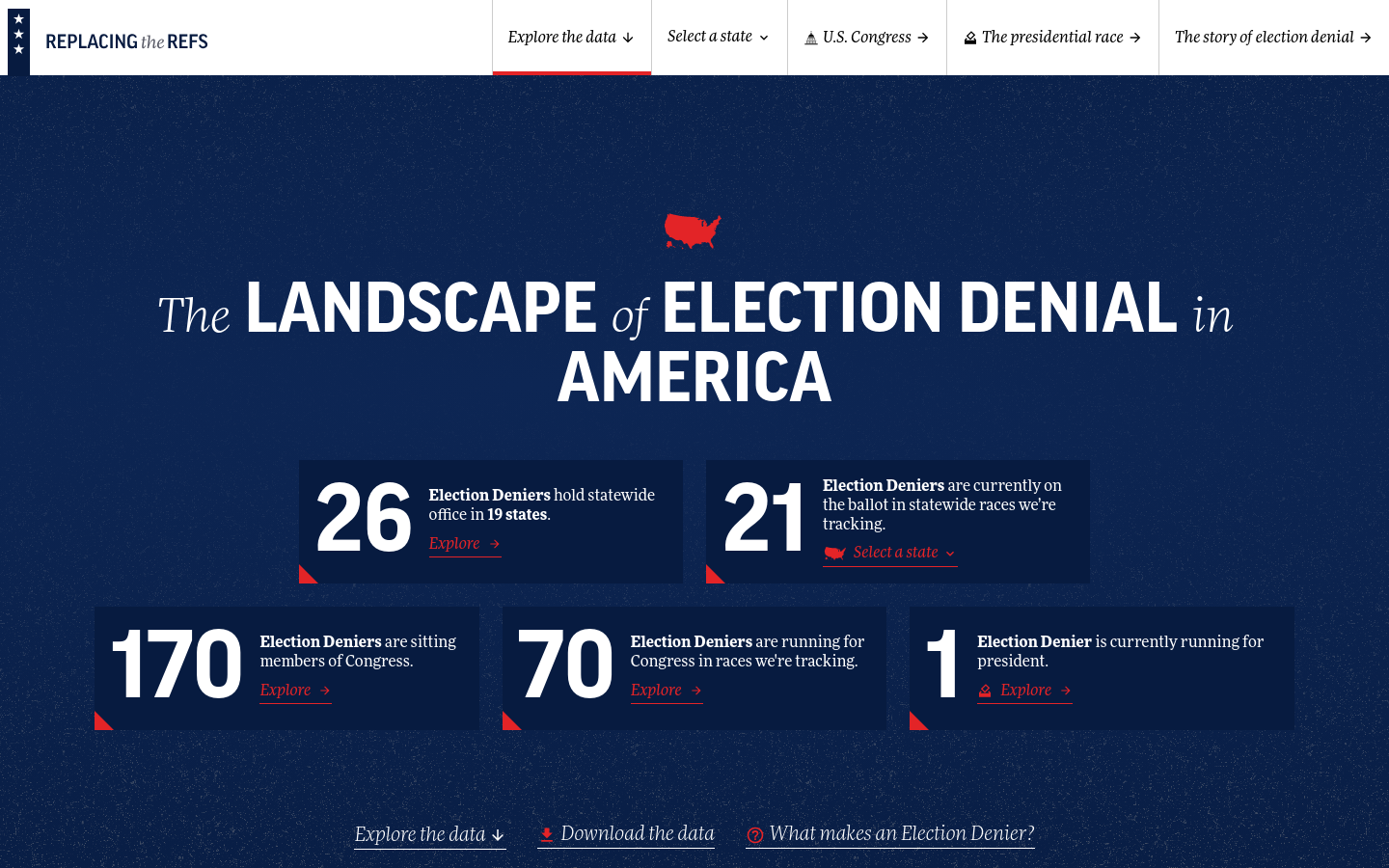
Replacing the Refs
United States of America 🇺🇸The Landscape of Election Denial in America

An Analysis and Deep Dive Into New York City Subways
New York City (NYC / New York, NY)A Tableau data visualization and analysis of public transit in NYC
Get email updates
Helpful Links
Reach Out
A project of

With support from
National Endowment for Democracy
Founding Organization
Civic Hall
Technology partner